Long-term partner evolution—second-generation site refinement to better reflect craftsmanship and ongoing business growth.
The Context
Tension has partnered with Grapevine Cabinets since 2013. Over that time, the company grew from a strong local business into a well-established name in cabinet painting and refacing throughout the Phoenix market. This project marked the second generation of the website—a natural evolution shaped by years of business growth and changing customer expectations.
The goal wasn’t reinvention. It was refinement.
The new website needed to better reflect the quality of the work, improve clarity for homeowners, and create a stronger digital foundation for the next stage of the business.
The Challenge
The original website had served the company well for years, but the business had outgrown it.
As services expanded and expectations changed, the experience needed to feel more aligned with the level of craftsmanship and professionalism Grapevine had become known for. At the same time, the redesign needed to preserve the familiarity and trust the company had already built with homeowners over time.
The challenge was finding the balance between progress and continuity—modernizing the experience without losing what already worked.
Objectives
- Modernize the digital experience while maintaining brand familiarity
- Better communicate services and craftsmanship
- Improve content clarity and overall user flow
- Build a flexible foundation for long-term growth
Strategic Direction
Rather than approaching the redesign as a visual reset, the strategy focused on evolution.
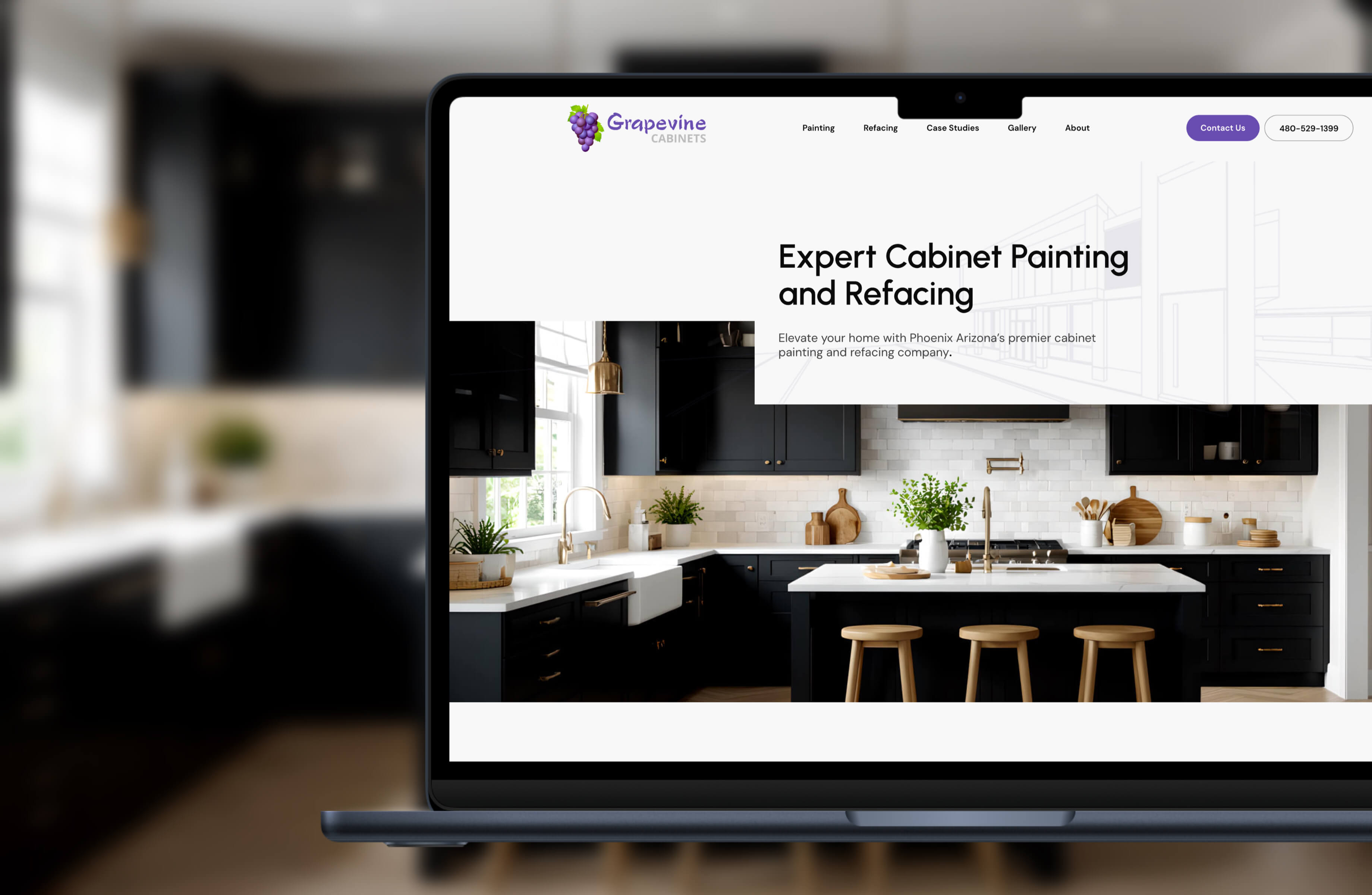
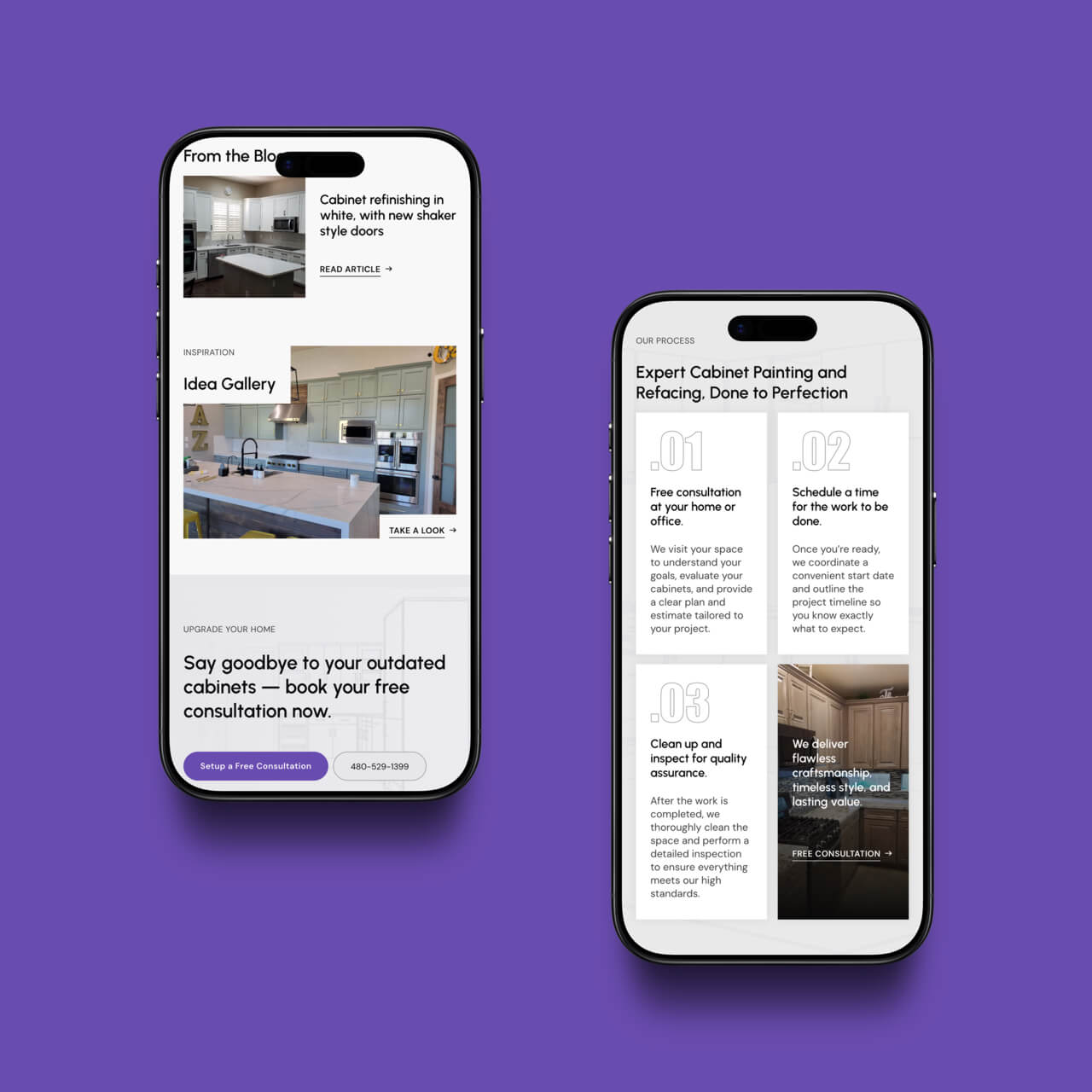
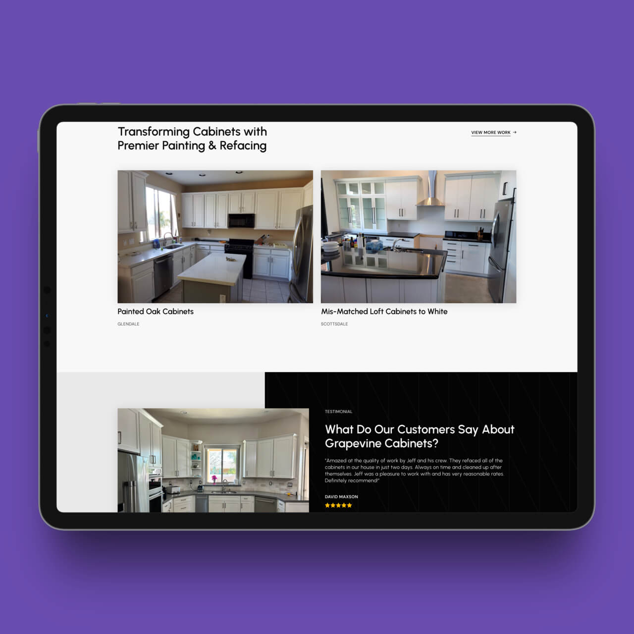
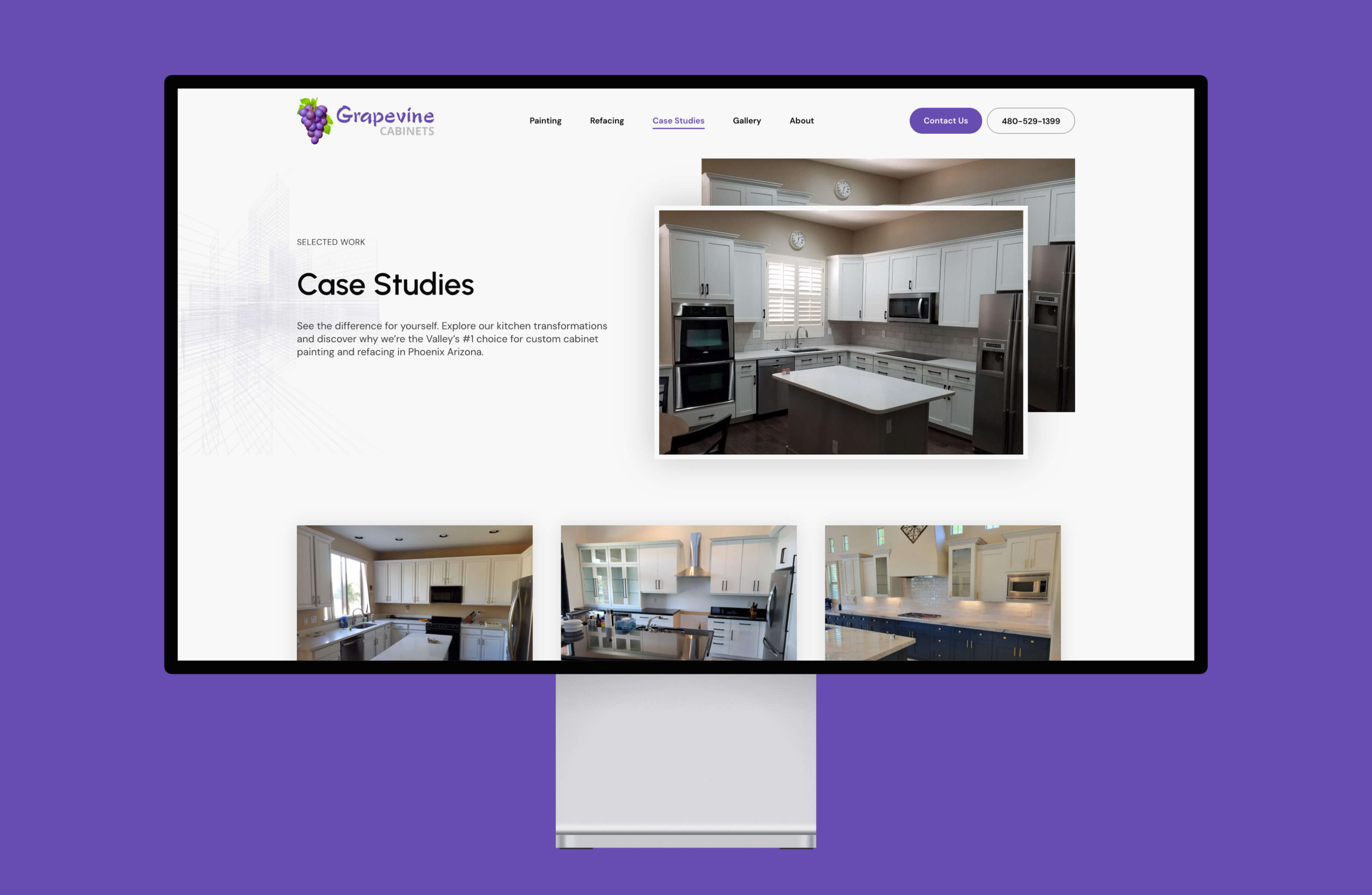
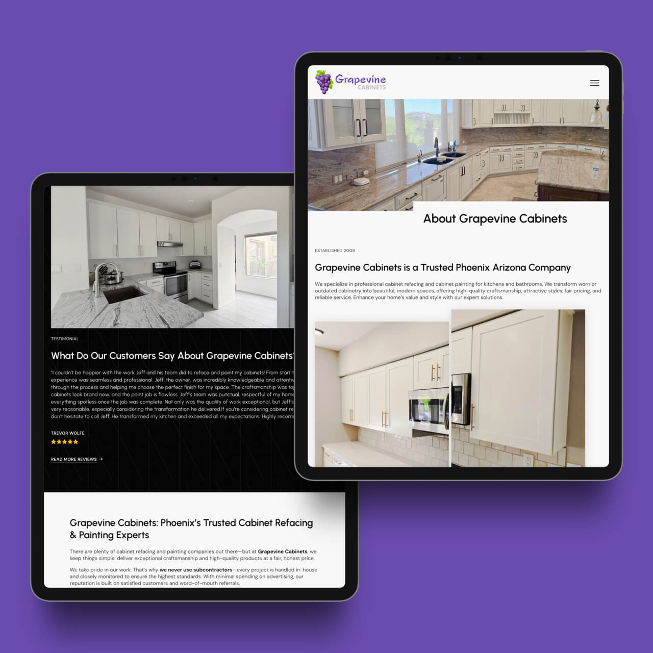
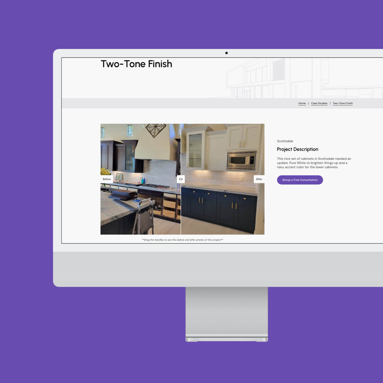
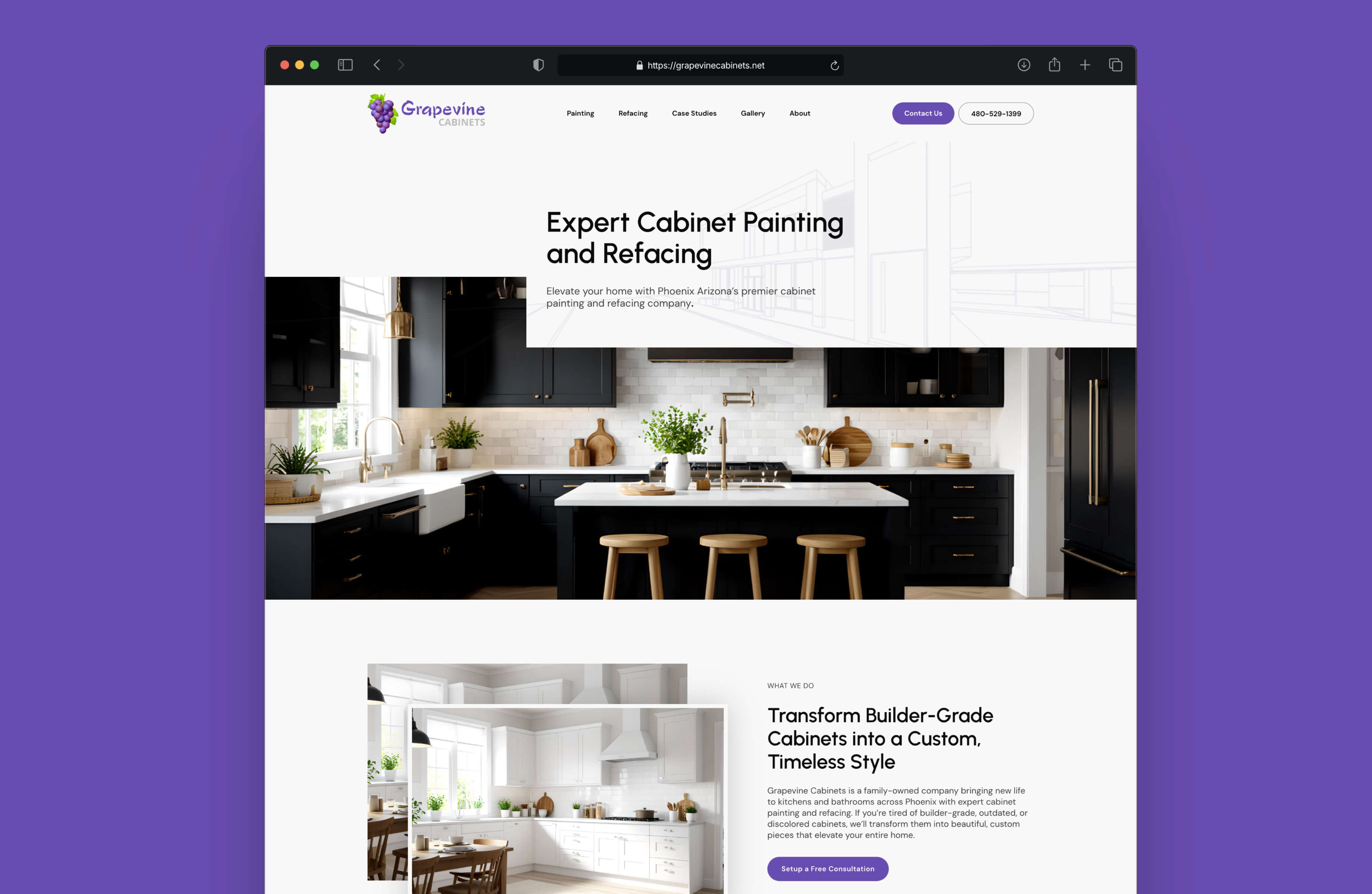
The experience was simplified, messaging clarified, and the work itself placed at the center of the story. Because cabinet transformations are inherently visual, the website was designed to build trust through project examples, clear process communication, and thoughtful restraint.
The goal was simple: help homeowners quickly understand both the service and the standard of work without overexplaining or overwhelming the experience.
Experience Design
The experience was restructured around how homeowners actually make decisions. Services are easier to understand, project examples are easier to browse, and key actions feel intuitive without becoming intrusive.
Information unfolds intentionally—providing enough detail to build confidence while keeping the experience clear and approachable.
The result is a website designed to reduce friction, establish trust early, and make the next step feel obvious.
Visual System
The visual direction emphasizes clarity, craftsmanship, and restraint. Clean layouts, confident typography, and intentional spacing allow project photography to carry much of the experience.Rather than relying on excessive decoration, the design stays focused—creating a presentation that feels premium, timeless, and reflective of the quality behind Grapevine’s work.
Key Highlights
- Second-generation website built through a long-term partnership
- Refined service architecture for greater clarity
- Project-driven storytelling designed to reinforce trust
- Flexible platform built to evolve alongside the business
The Outcome
The result is a website that better reflects where Grapevine Cabinets is today—established, trusted, and deeply focused on craftsmanship. Homeowners can better understand services, explore examples of the work, and move forward with greater confidence, while the business benefits from a stronger digital foundation for continued growth.