Startup restaurant launch—built a clear, confident digital presence from zero to support opening day and early growth.
The Context
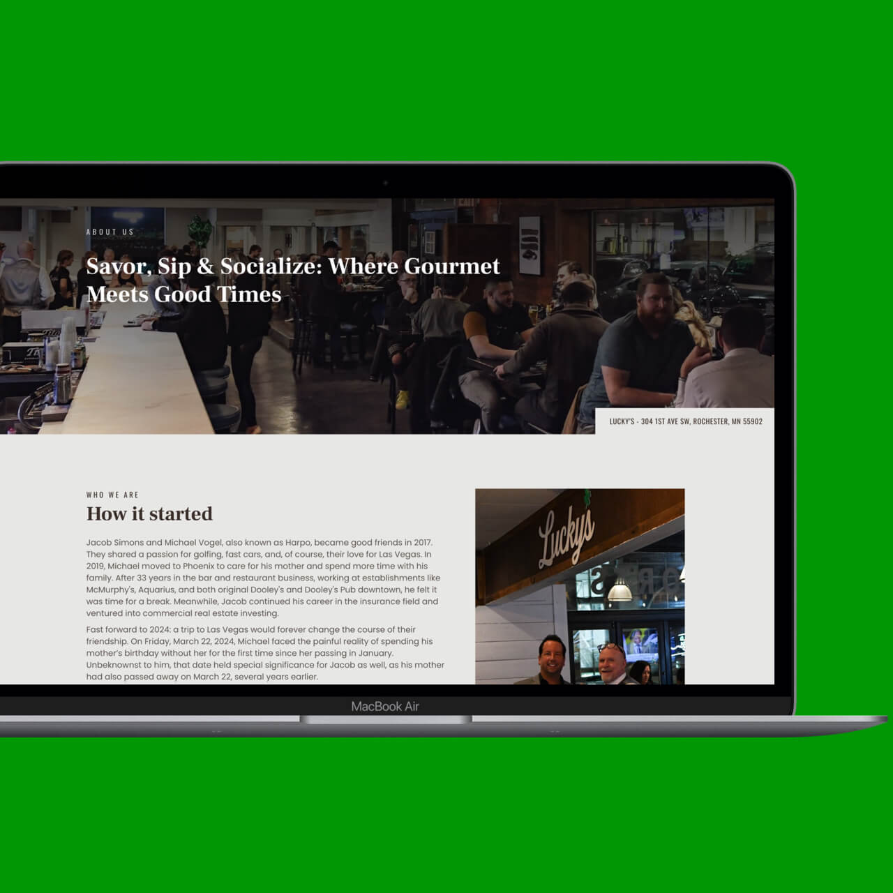
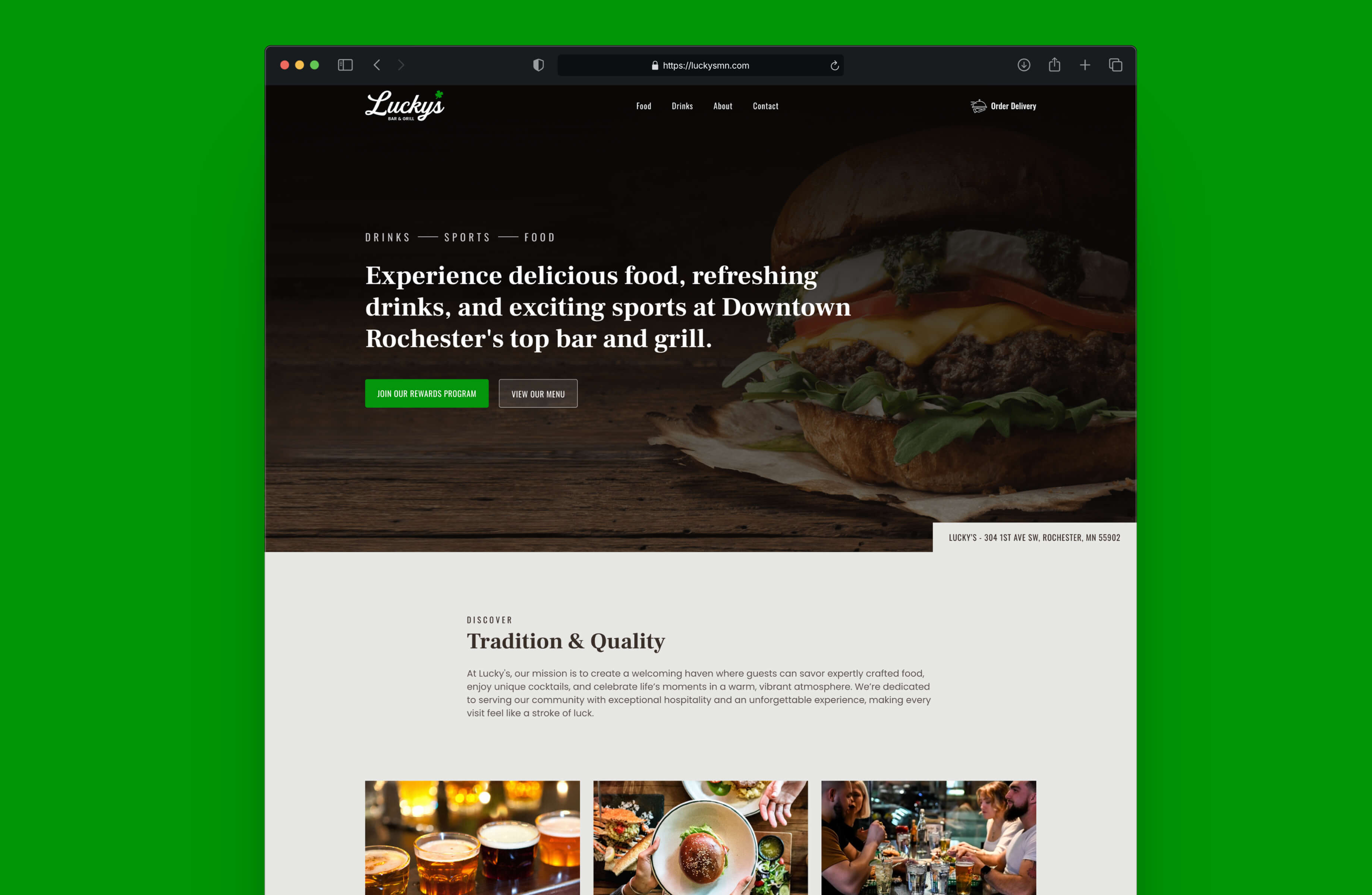
Lucky’s Bar & Grill launched as a new restaurant concept with no existing website or digital presence. While the physical space and brand were taking shape, the business needed a clear online foundation to support opening day and establish credibility from the start.
For many customers, the website would be their first interaction with Lucky’s—shaping expectations before they ever walked through the door.
The goal was to create something simple, clear, and aligned with the atmosphere of the restaurant itself.
The Challenge
Starting from scratch meant the challenge wasn’t redesign—it was definition.
Without an existing digital presence to build from, the website needed to quickly communicate what Lucky’s was, what it offered, and why someone would want to visit. At the same time, it had to feel approachable and easy to manage, leaving room for the business to grow over time.
The challenge was finding the balance between personality and clarity—capturing the character of the restaurant without overcomplicating the experience.
Objectives
- Establish a credible digital presence from day one
- Communicate the restaurant’s atmosphere and offerings
- Make essential information easy to find
- Build a foundation flexible enough to evolve over time
Strategic Direction
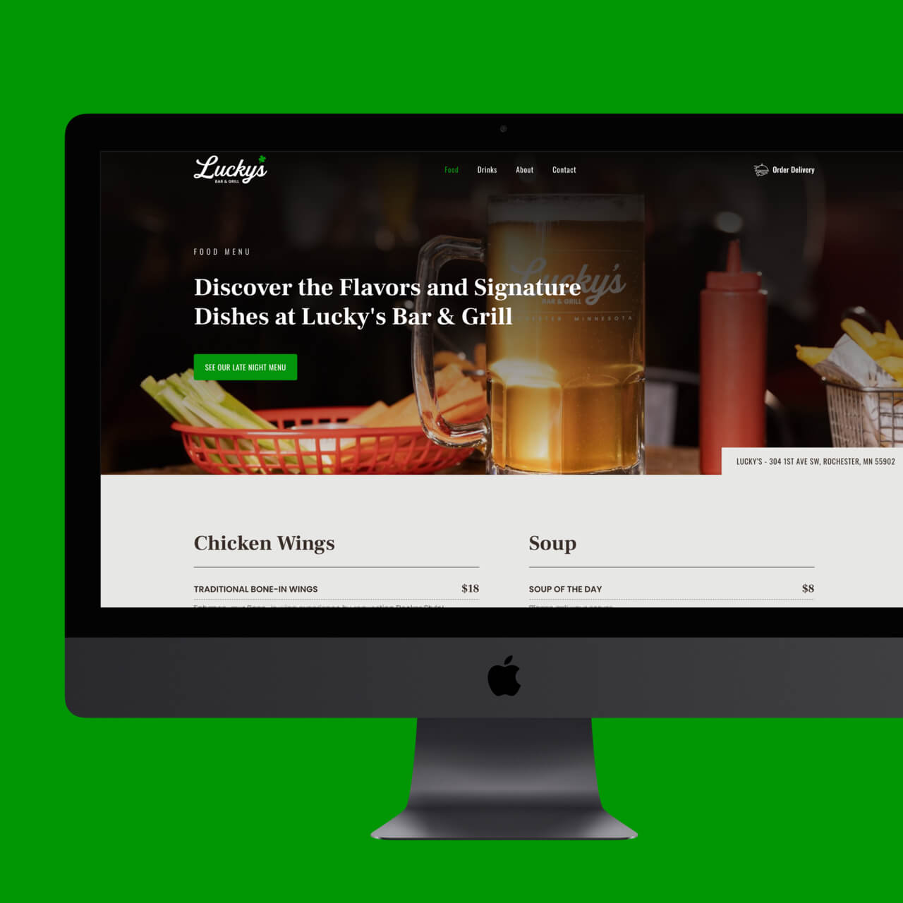
The strategy focused on clarity first.
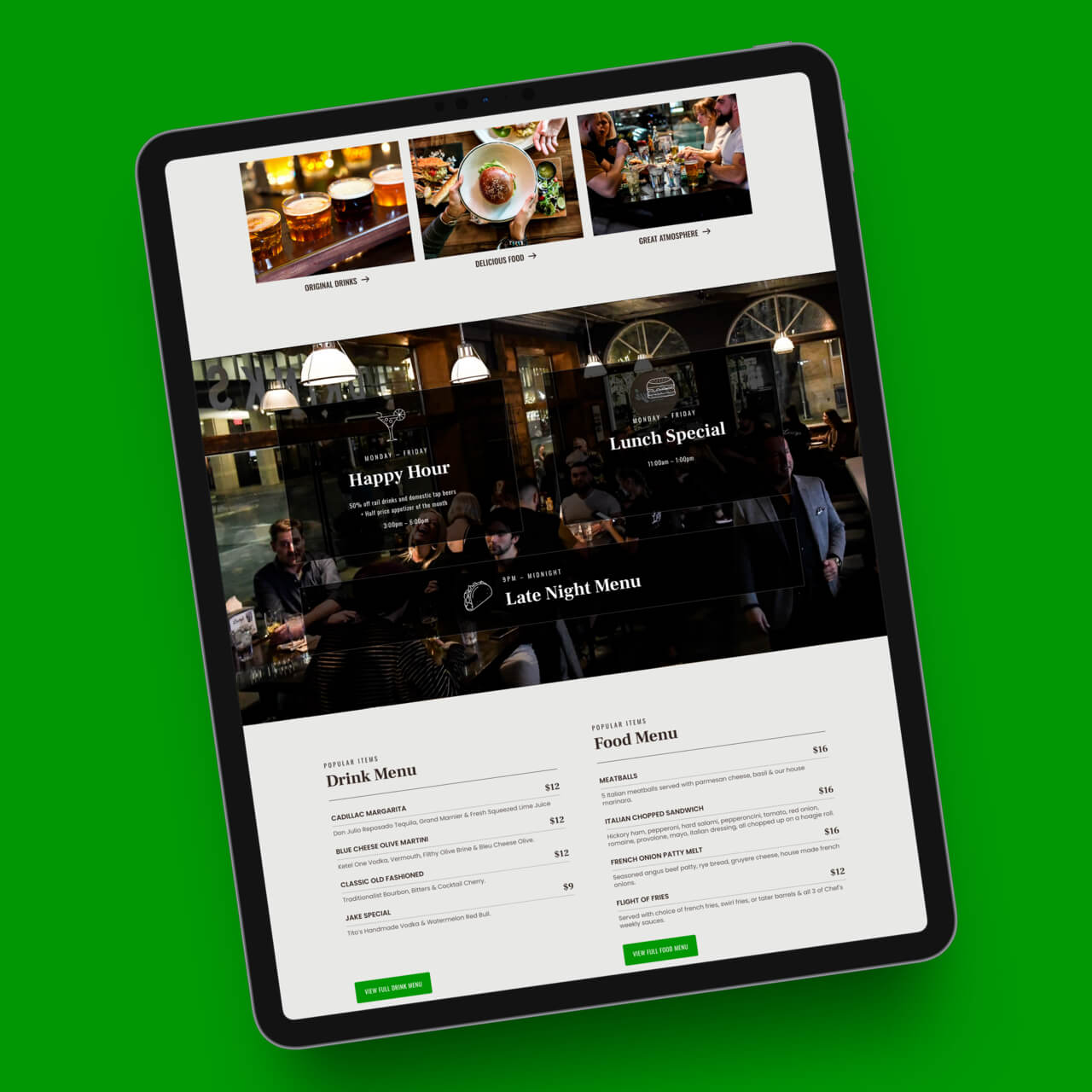
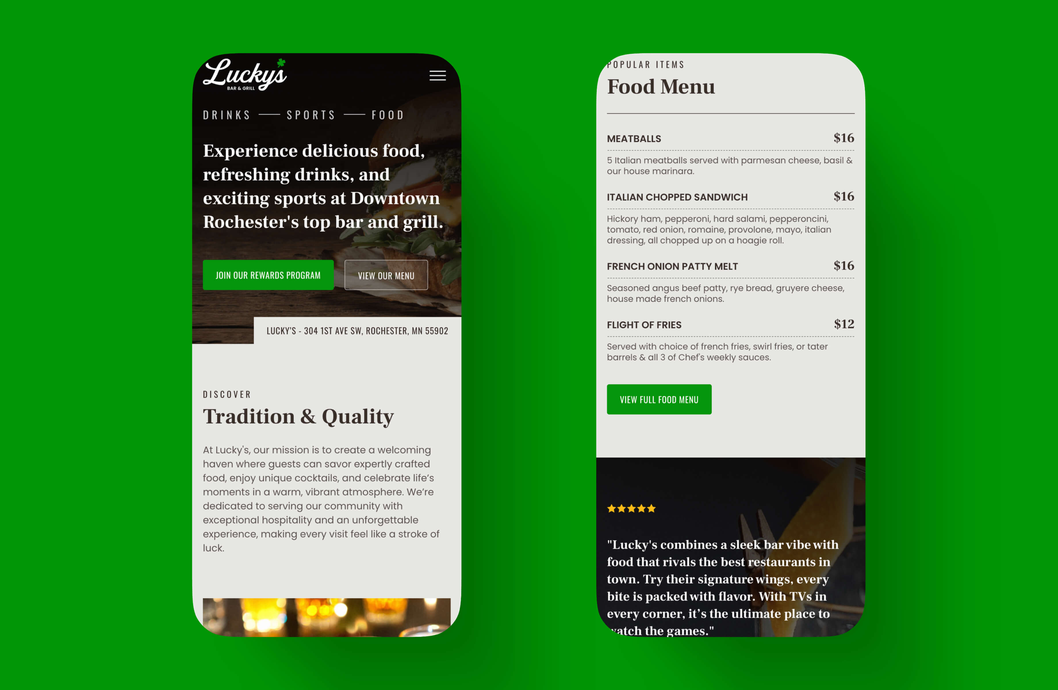
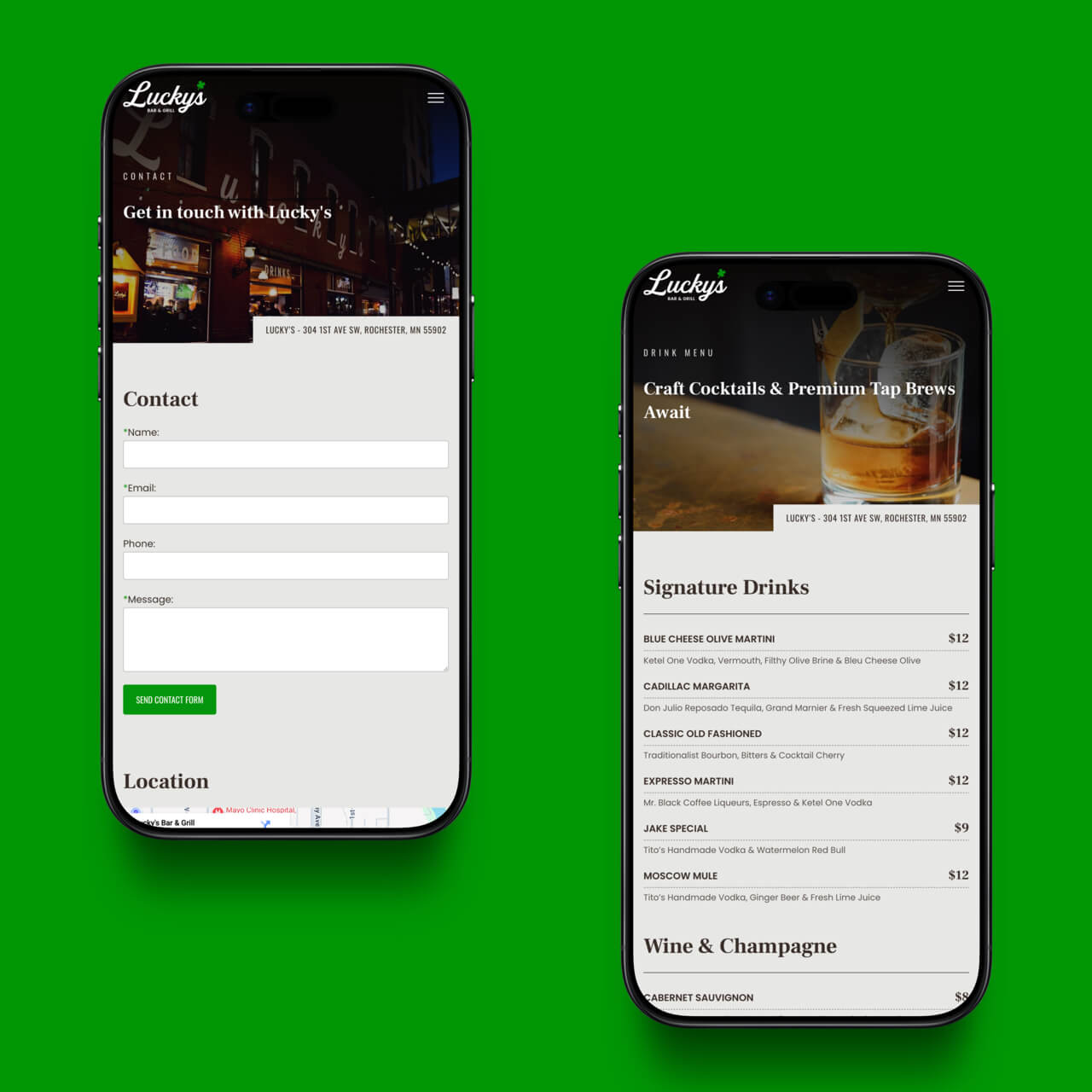
Rather than overwhelming visitors with unnecessary content, the experience prioritized what matters most to someone deciding where to eat or meet—menus, hours, location, and overall atmosphere.
By keeping the structure intentional and the content focused, the website helps establish trust while allowing the personality of the restaurant to come through naturally.
The goal was simple: make it easy for someone to decide, “Yeah, I’d go there.”
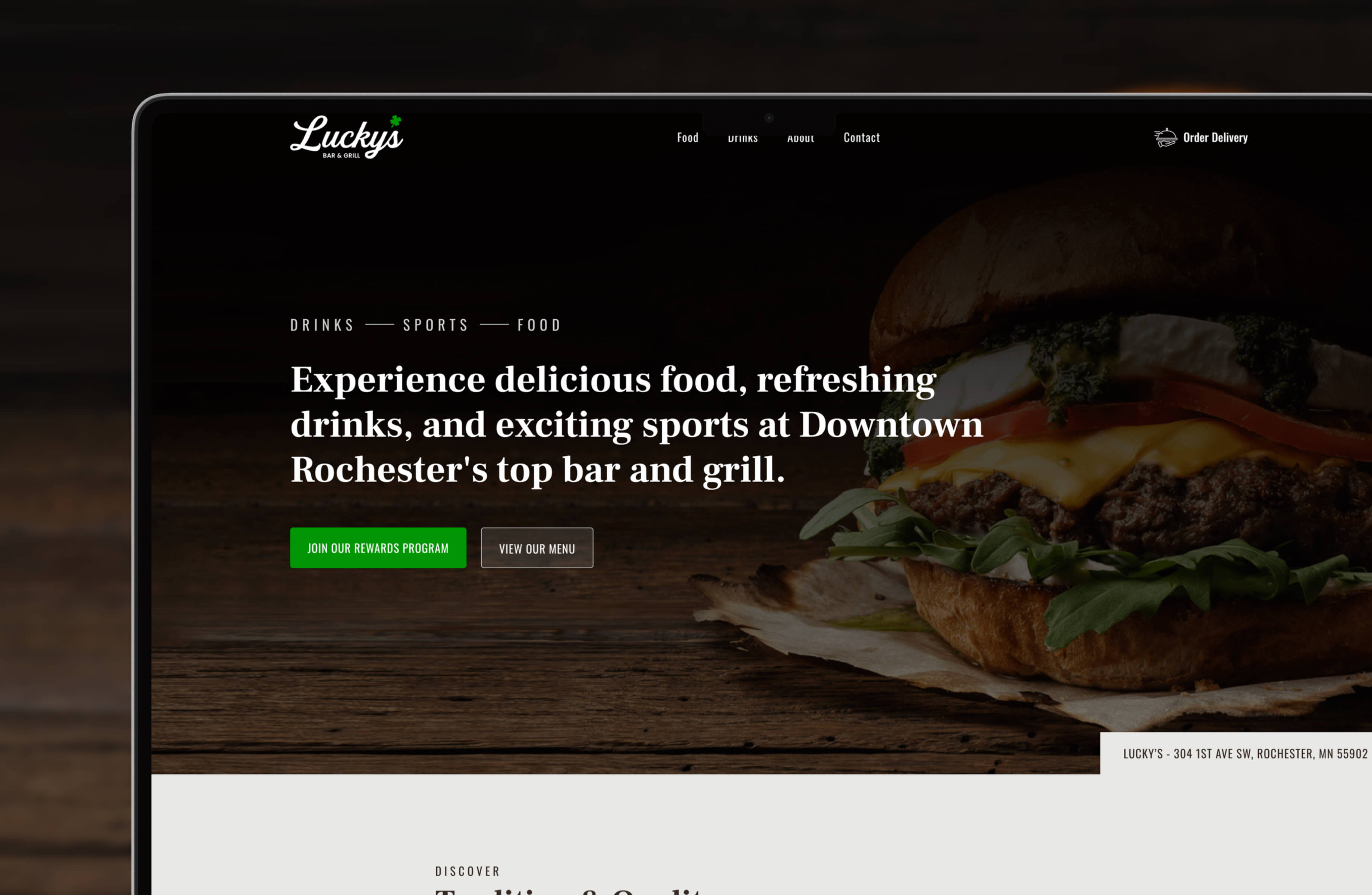
Experience Design
The experience was designed to feel intuitive and familiar. Visitors can quickly understand what Lucky’s offers, get a feel for the atmosphere, and find the information they need without friction.
Clear navigation, simple layouts, and thoughtful spacing create an experience that feels effortless—helping first-time visitors make quick decisions without distraction.
The result is a website that works the way a neighborhood restaurant should: straightforward, welcoming, and easy to use.
Visual System
The visual direction balances confidence with restraint. Dark tones, strong typography, and clean layouts create a grounded, familiar feel that reflects the atmosphere of a neighborhood bar and grill while still feeling polished and modern.
Rather than relying on unnecessary embellishment, the design stays focused—allowing the brand to speak clearly and confidently.
Key Highlights
- Launch-ready website built from the ground up
- Simple menu structure designed for easy updates
- Clear hierarchy built around first-time visitors
- Flexible foundation designed to support future growth
The Outcome
The result is a polished digital presence that helped support Lucky’s launch and establish credibility from day one. Customers can quickly find the information they need, while the owners have a platform that’s easy to maintain and flexible enough to grow alongside the business.