Growth-stage SaaS partnership—supported transition from Arizona-focused company to national provider across 40 states.
The Context
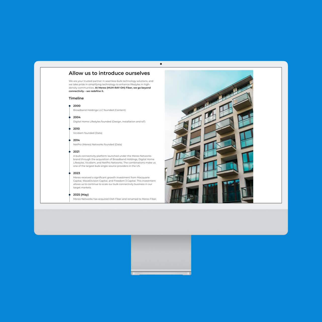
Tension began working with Mereo in 2023 during a pivotal period of transition. At the time, the company had narrowed its focus to Arizona, creating an opportunity to sharpen positioning and build a digital presence aligned with a more focused market strategy.
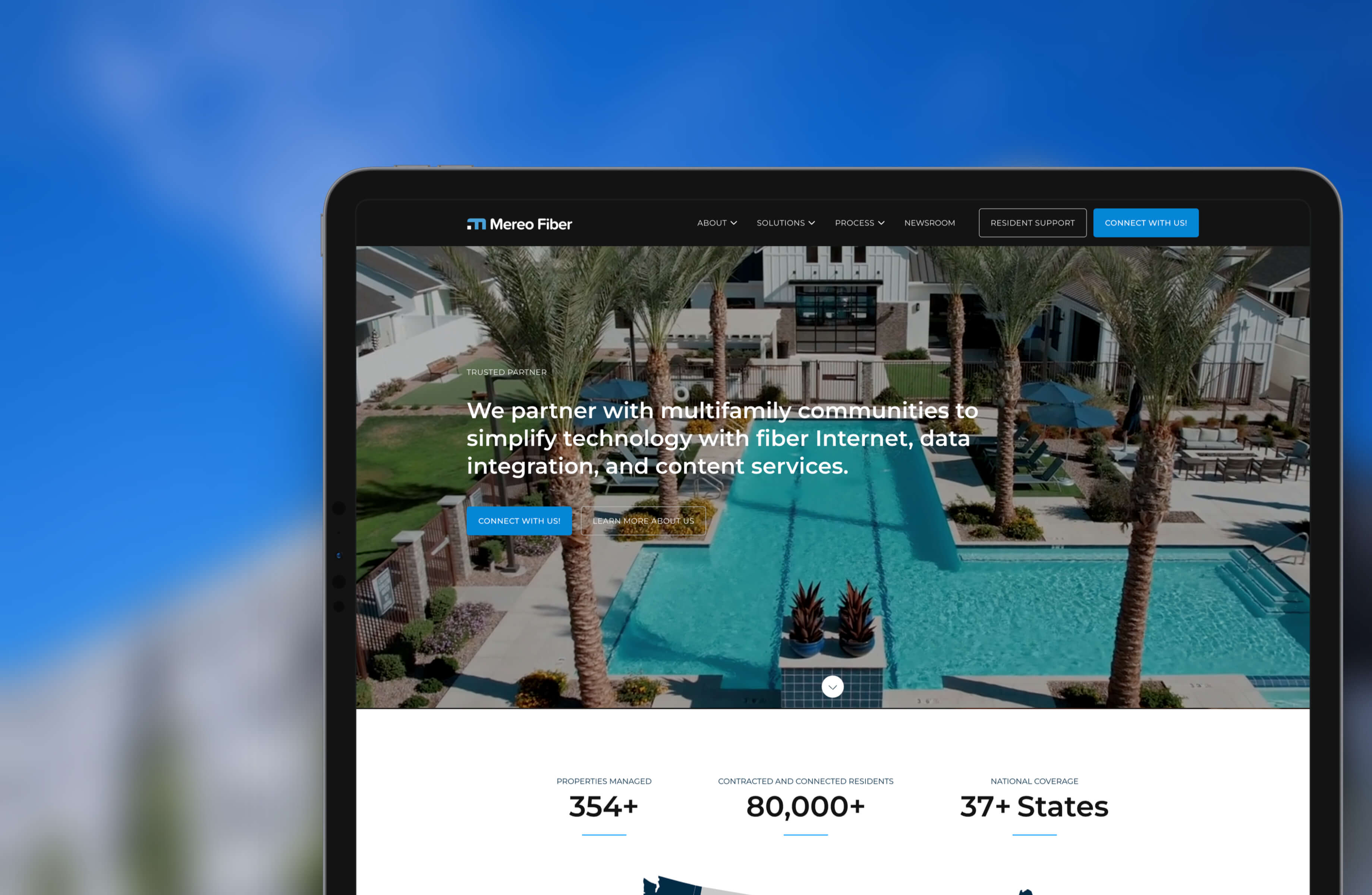
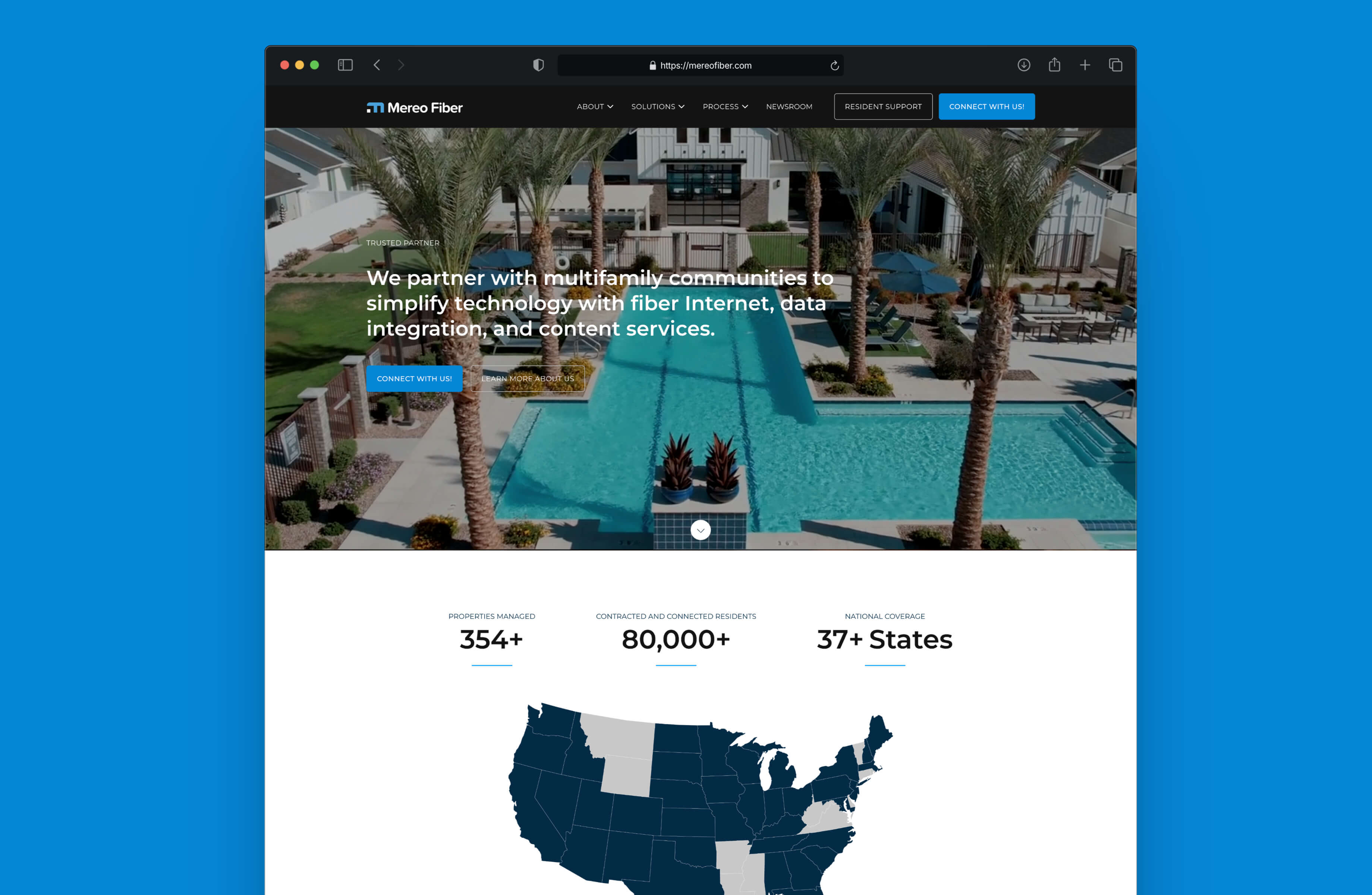
What began as a regional effort quickly expanded. Since then, Mereo has grown into a national provider of fiber internet, data integration, and connected technology solutions for multifamily communities, now serving properties across 40 states.
The website needed to support not only where the company was—but where it was headed.
The Challenge
Mereo operates in a technically complex industry.
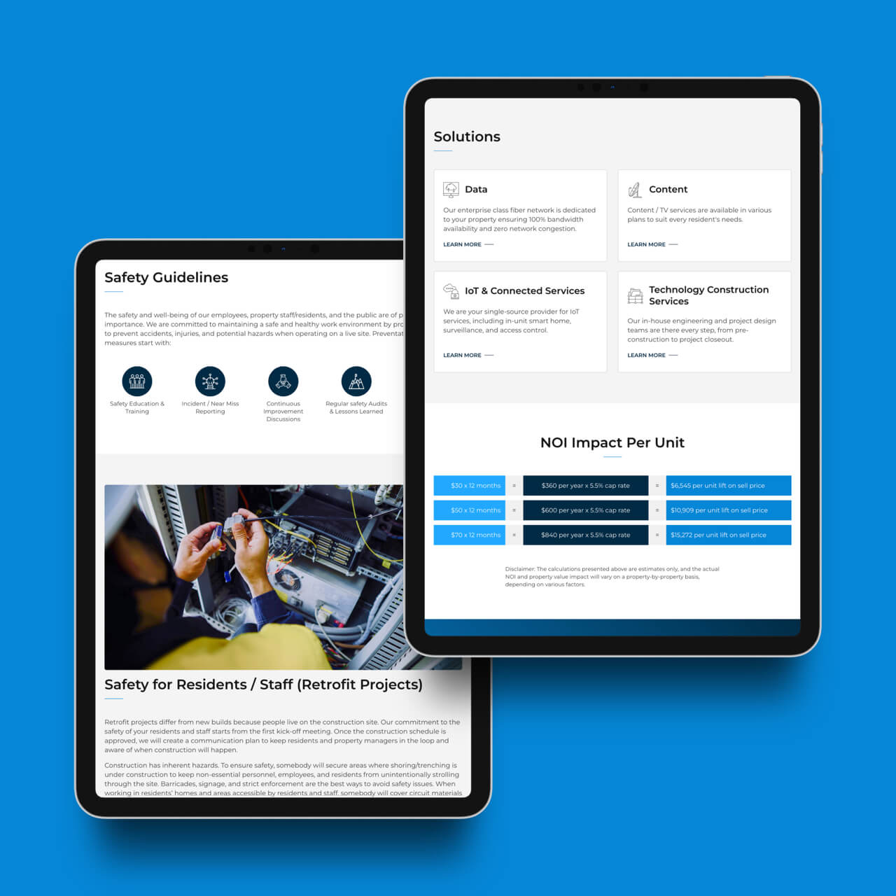
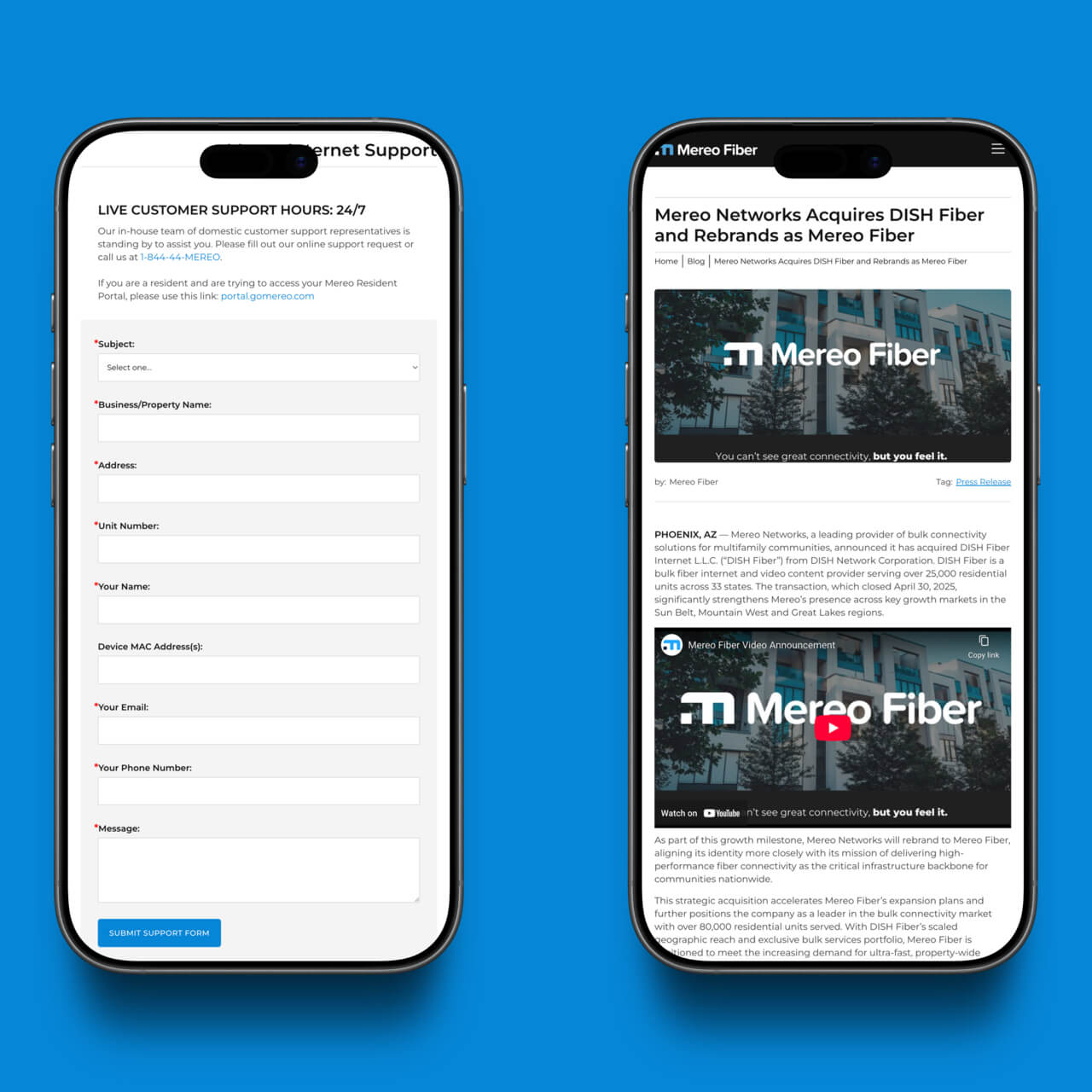
Its services span connectivity, infrastructure, IoT, content delivery, and technology integration—making clarity essential. The challenge was creating a website sophisticated enough to reflect the depth of the business without overwhelming visitors in the process.
At the same time, the platform needed the flexibility to support rapid expansion, new markets, and an evolving service footprint. As the business grew, the digital experience had to grow with it.
Objectives
- Clarify Mereo’s positioning in a complex industry
- Simplify how services are communicated
- Create a scalable platform for future expansion
- Build credibility for regional and national growth
Strategic Direction
The strategy centered on simplification as a path to clarity.
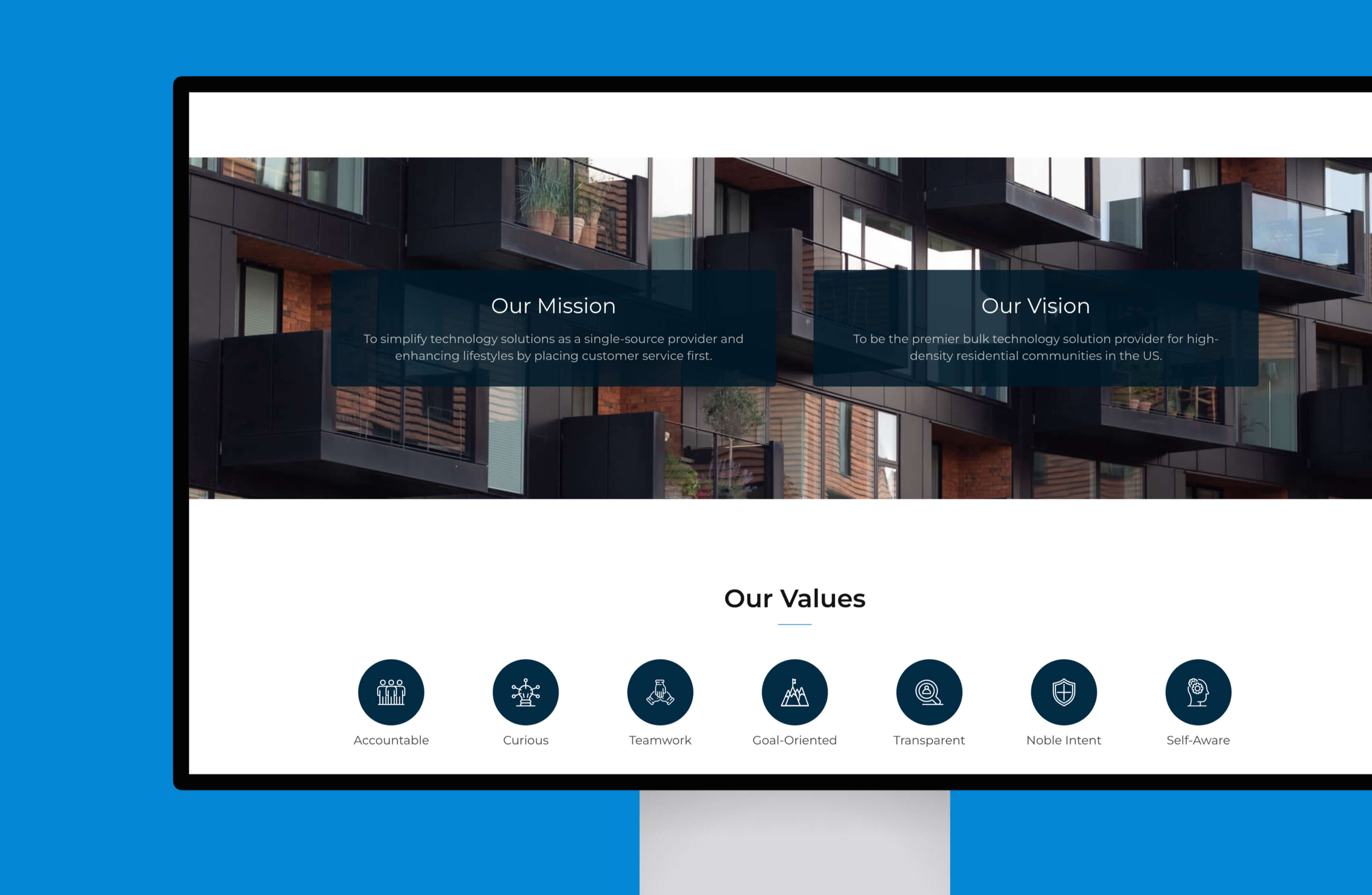
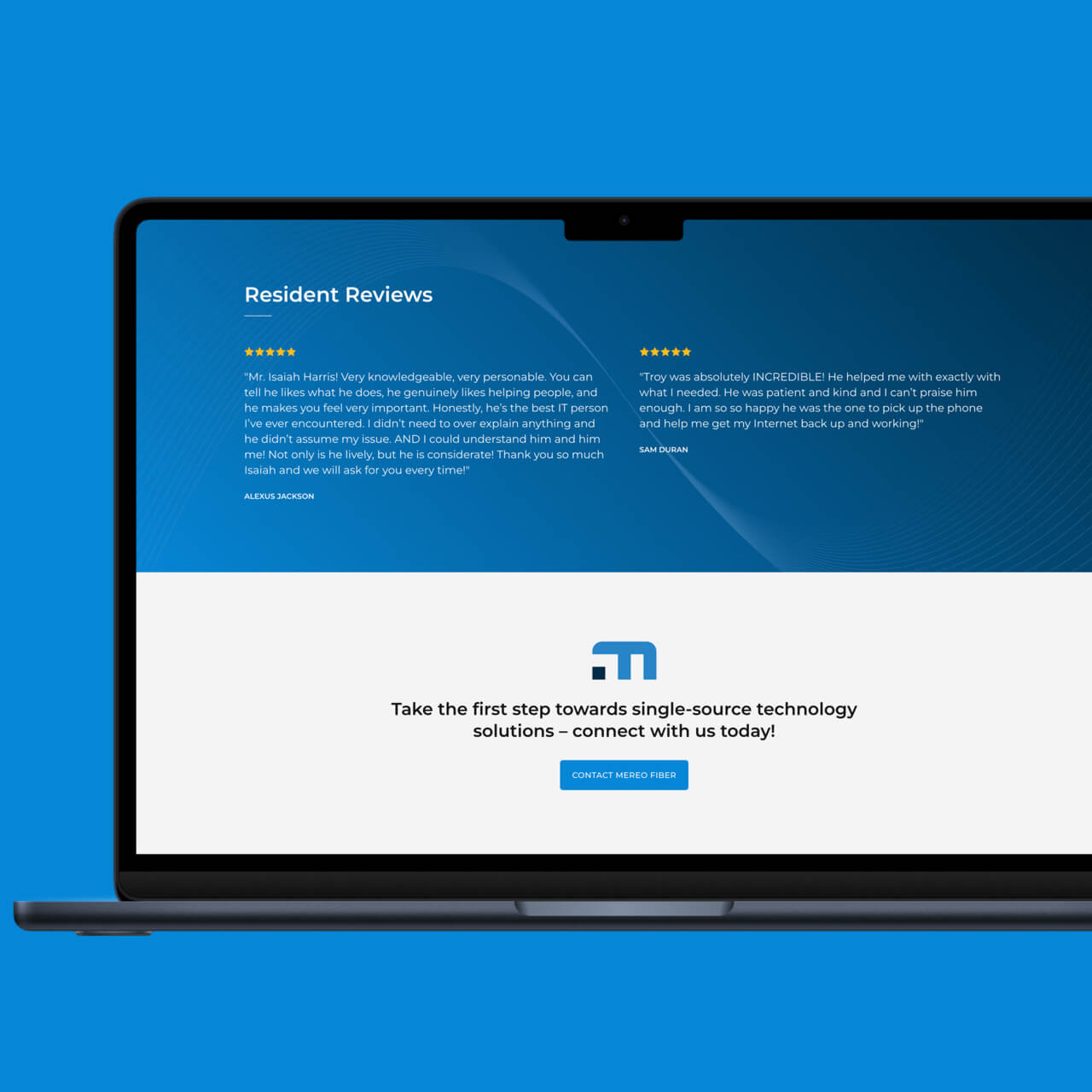
Rather than overexplaining technical services, the experience was organized around audiences and outcomes—property owners, developers, managers, and residents, along with the value Mereo brings to each.
Service architecture was streamlined, messaging became more focused, and the overall experience was designed to reinforce confidence rather than complexity.
The guiding principle remained simple: as the business scales, the experience should stay clear.
Experience Design
The experience was structured to help visitors quickly understand both the breadth of Mereo’s services and the role the company plays within connected communities.
Navigation was streamlined, content hierarchy refined, and service pathways simplified to reduce friction and improve understanding. As new markets and offerings emerged, the system was designed to adapt without sacrificing clarity.
The result is a platform built to communicate complexity in a way that feels approachable and easy to navigate.
Visual System
The visual direction balances technical credibility with accessibility. Clean layouts, intentional spacing, and confident typography create structure without feeling overly corporate or overly technical.
Rather than competing with the message, the design creates space for infrastructure, services, and positioning to communicate clearly—while remaining flexible enough to evolve alongside the business.
Key Highlights
- Website launched during a major growth phase
- Platform structured to support expansion across 40 states
- Simplified service architecture designed for clarity
- Flexible content system built for long-term growth and adaptability
The Outcome
The result is a website aligned with Mereo’s evolution from a regional company to a national provider. What began as a focused Arizona presence now supports a footprint spanning 40 states—giving the company a digital platform designed to grow alongside the business.